Tag: Packaging Design

Fonts for Future-forward Packaging 

Looking to make your packaging a little more futuristic. 

There is no specific definition for futuristic, but a lot of fonts will have minimal aesthetics, and will also utilize weird geometric shapes. There is also sans-serif, which is popular in the tech and business world, especially for smart technology, and for brands that are modern, in order to build reputations. 

Here, we’ll give you some of the best fonts for packaging, in both commercial and personal use and while it might be a little challenging to get these, we’ll tell you how you can. 

Blanka 

This is a font designed by Emmeran Richard and is the first of the many futuristic typefaces that the graphic designer has. It’s unconventional and minimalistic and is created by using different parts that are missing from various letterforms. 

It’s free for both commercial and personal use, so you might want to look into this one. 

Ailerons 

This is a font that’s designed by Adilson Gonzales and is a very clean typeface with tall types of letterforms. It’s perfect for innovative, premium feels to packaging,  and is great for occupying packaging space, especially if it does stand on the taller end.

This one is free for personal usage, and if you want to use it for commercial endeavors, make sure to contact the artist to find out if you can. 

Eliano 

This is another one designed by Emanuele Papale, and it works with various geometric shapes, creating a fun and futuristic sort of aesthetic.

It utilizes the A as a triangle, and then the O is an additional dot within this. 

It’s Avant Garde, and it won’t have organic lines, so it’s more geometric than anything else.

It’s free for both personalized and commercial use and can be a fun way to really stand out. 

Exan-3
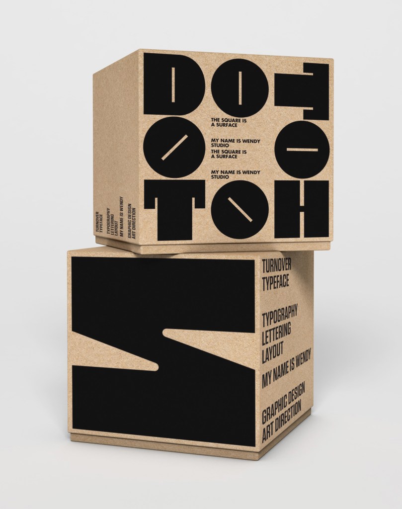
This is a font that’s created by Jon Carlos and is known as a monospaced sort of font that offers a futuristic yet retro look, with a mixture of both curved and straight lines, and the usage of angular, and rounded corners. 

It’s great, and since it is monospaced, it makes this font a lot wider, and ideal for packaging that tends to also be a bit wider as well. 

It’s free to use for both personalized and commercial usages. 

Stellar

This is a font that’s been created by Mathieu Desjardins, and it’s a minimalistic type, especially compared to the others we’ve listed. It achieves the futuristic and aesthetics of this through clarity and simplicity. It’s great because it comes in 4 different weights, and you can use this with over 33 different languages. 

It is free for both commercialized and personal use. 

Dual 

Finally, there is DUAL, which was created by Charles Daoud, and is inspired by the Neue Haas and Gotham fonts. 

This is one with straight lines and over 90 degree angles, creating a feel that’s experimental and unique. It has a sans serif and full width type of design also make this complex, but also minimalistic all at the same time. 

It comes with 251 alternate types of glyphs, and 10 different stylistic types of sets, so it’s super flexible. It also provides support for both North America, and also South America, along with other parts of Europe too.

The 300 type is free both personally and commercially, whereas the other weighted options are a little bit pricier, but if you don’t need to pay, you can just get the regular and it will do well with a lot of personalized and commercial touches for your own various needs as well. 

How to Balance Simplicity and Functionality in Minimalist Packaging 

Minimalism is all the rage, and with more people using it, you definitely want to make sure that it’s simple, and effective.

Balancing both simplicity and functionality is important. Minimalism as a trait means that there’s only the minimum left, and you’re not throwing an overabundance of design to the items that you have.

Being able to balance these and make your packaging stand out is a feat in it of itself. Here are some fun ways to balance both the simplicity and the functionality of your packaging experience.

Keep Everything Simple 

Overcomplicated designs and packaging crowding are not what you need with minimalism in packaging.   You don’t need a ton of images or decorative elements either. The goal is to focus on uncluttered and clean designs, along with carefully choosing the elements that will represent the products at hand. It will definitely change the way people see the products and keep the shine that you want.

Utilize Fonts that are simple. 

Fonts that are fancy like cursive swirls will definitely be a contrast to your packaging. Simple and block-style fonts are the way to go with packaging minimalism. The goal is to get to the point, and you are able to do that with your packaging fonts. 

Contrast Galore 

Contrast is kind of cool because it can really make designs that you have pop. A key part of minimalism is to use this, because it creates better visual interests, and highlights design elements that you might not be able to use otherwise.

While you aren’t going to crowd the packaging with a ton of images, highlighting the small parts of what matters plays a huge role in making minimalism shine on all fronts. 

Make the Materials High Quality 

While you are going simple with the design, that doesn’t mean you use low quality materials.   It might be tempting, but the big thing with minimalism is that it stands out and looks good, but also is high in quality, so you are able to highlight the little things that are there. 

Being simple and complementing the current packaging state with this is so important that you will definitely want to use this, no matter what. 

Sustainable Materials, and Less Too 

Finally, you want to use less material.   Less material means that you’re not shoving a bunch of void fill in it.   you want to strike the balance between the minimal and the functional, so don’t go and shove a ton of material in there.

This does save money too. when you’re shipping via dimensional weight, you will notice it goes down if you practice minimalism, saving brands of all kinds in costs as well.

Then of course, there’s the materials that come with this. you should use compostable and recyclable materials. That doesn’t mean that you can’t use a little bit of plastic if that’s the only option but try to shoot for bioplastics or something more sustainable.

Focusing on reusable packaging and reducing the amount of packaging waste is the final part of minimalism. You want to embody sustainability, and you can do this through the packaging that you offer.

With that said, minimalism is the way to go these days. With a striking balance between the functionality and the materials you use, you’ll be amazed at the difference this makes in the long haul. People are able to, with this as well, build the ideal experience they can with the materials that you have.   You will be able to embody all of this, creating the ultimate in functionality as well.